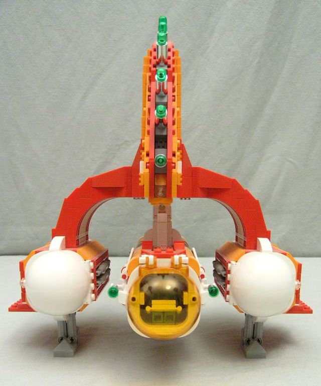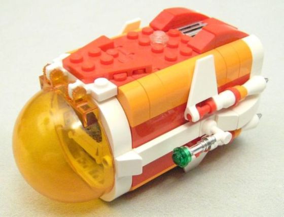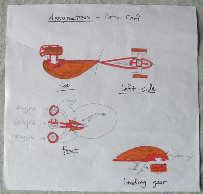
Luckily, I managed to save my only sketch for this ship, which when finished snowballed rather mightily into this diorama. I'd begun with the idea of constructing a very strong asymmetrical design as a break from my usual builds. I had the B-Wing from Star Wars in mind, as I've always admired its atypical appearance and simple elegance.
Aside from the (hopefully) unique physical appearance, I wanted to choose an unusual color scheme that would be evocative of muscle cars. I decided on red, orange and white because I don't see these colors used together very often.
*I'm especially glad that I kept the above sketch because of my spelling error in the title!
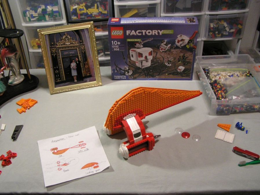
This picture is one of only two work-in-progress shots, but it gives you some idea of how LONG it has been since the ship was built and when the photographs were taken! I ordered the #10192 Space Skulls sets many moons ago!
I had hoped to achieve a more subtle curve for the body of the ship from the engine mounts and tapering down to the edges, but the basic construction challenge turned out to be more than enough!
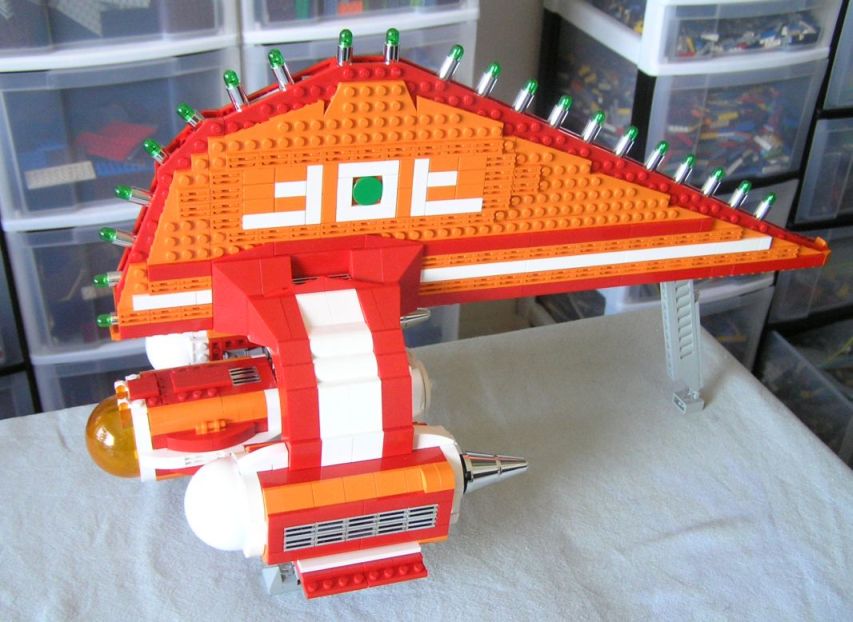
In this last WIP shot, the ship is basically finished. I was waiting for a Bricklink order of orange tiles to finish off the hull, and I made a few changes to the top of the cockpit. You can also see the little hinged landing pad on the rear leg which I later removed.
I had hoped to design some kind of heiroglyphic emblem for the hull, but could not find any arrangement that was either too random or too similar to actual letters or numbers. So, I settled on something that I thought resembled wings and a green laser eye in the middle.
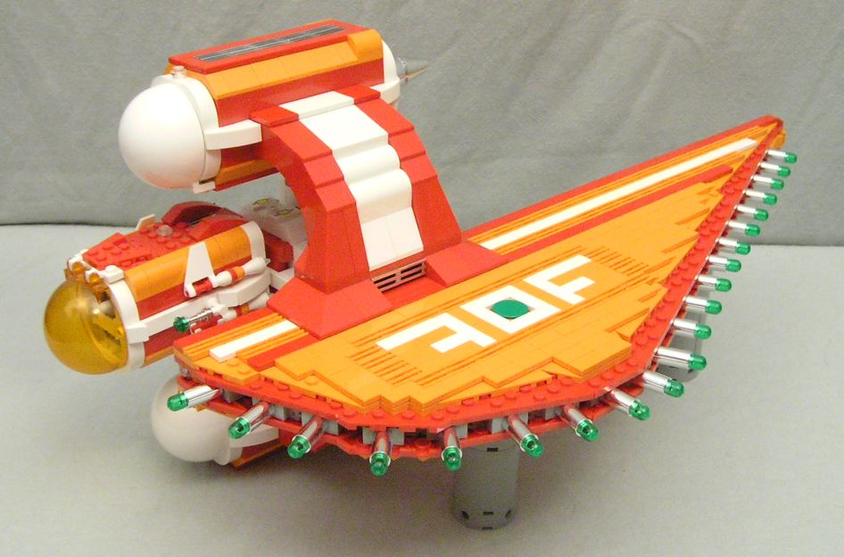
This is how the ship is meant to be seen while in flight. I envisoned it as flying in tight, graceful arcs while the green lasers pulse out a deadly spread of plasmic vengeance!
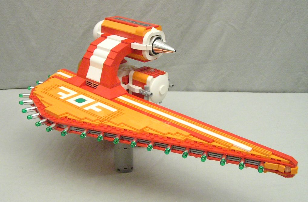
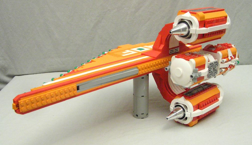
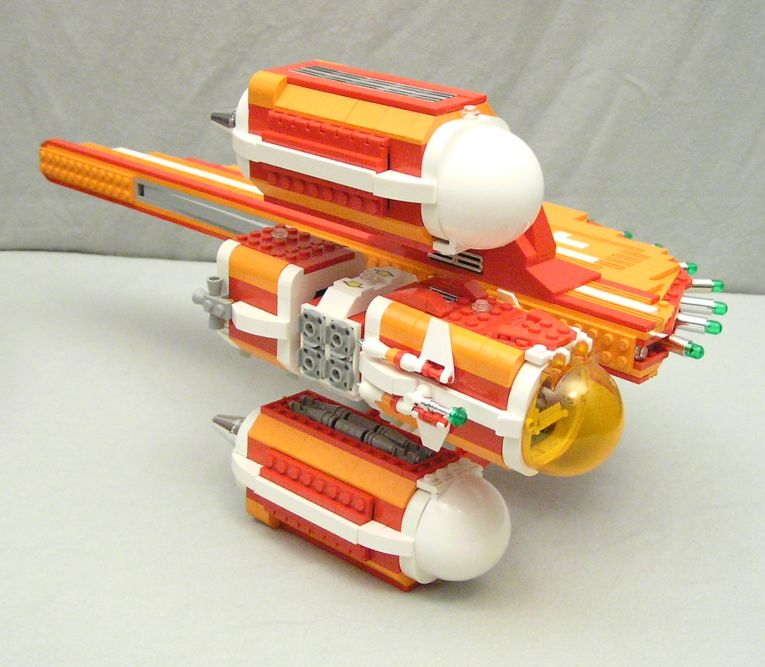
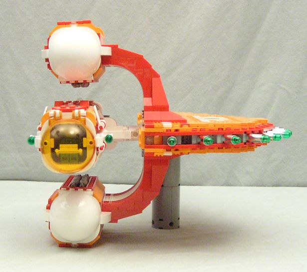
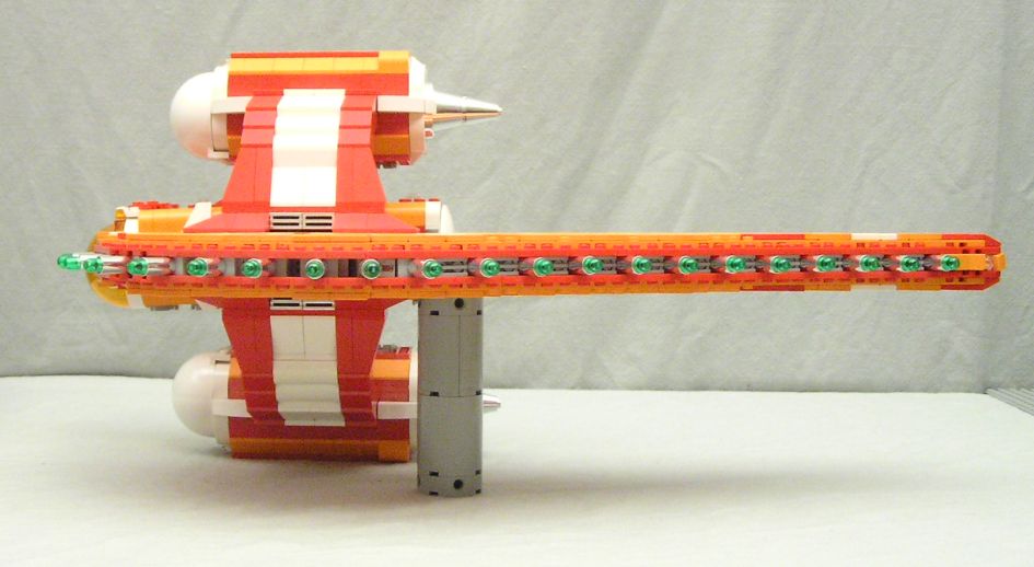
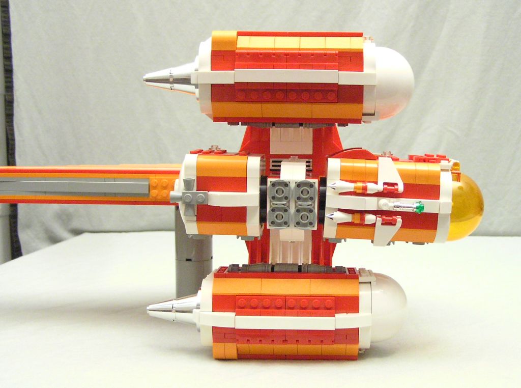
The one thing that I wanted very badly to work was to have a rotating cockpit, since I see the hull moving constantly around the cockpit as the pilot engages multiple targets. Coincidentally, this was also one of the initial ideas for the B-Wing, but it wasn't kept through the final design.
My final design worked ok, but as you can see, there's quite a noticeable droop. Since I wanted both modules to have a lot of available space inside for details, my connection and strength options were limited.
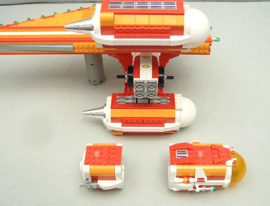
A single Technic axle runs through the rotation assembly, where I used two of the new click-turntables so that the cockpit would be positionable and not flop around haphazardly.
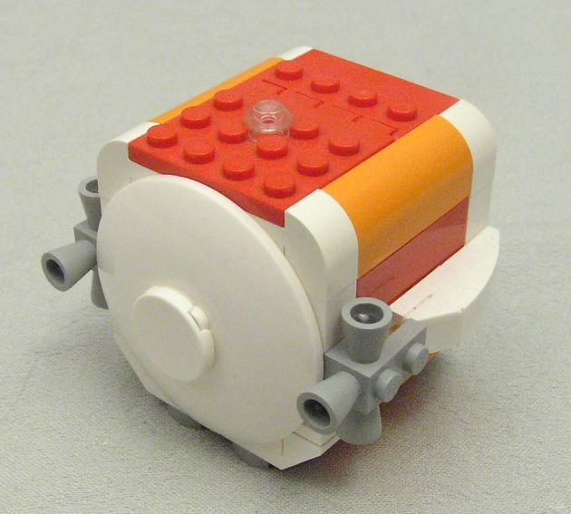
The smaller module is a survival pod, designed to eject from the hull along with the cockpit module. Its navigation systems keep it in a high orbit until called down by the pilot (if he survives).
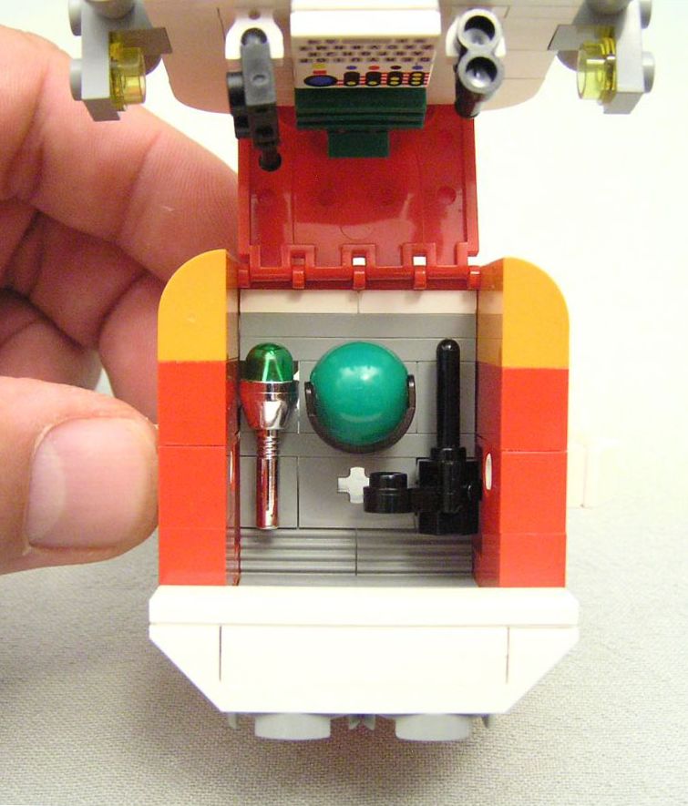
I had a challenging but fun time finding ways to cram in as much survival gear into the tiny space as possible. Here we can see a spare helmet, standard issue Pockster blaster, and a rangefinder.
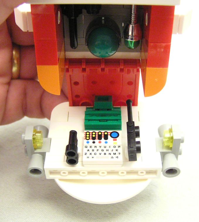
On the backside of the hatch we have a spare backpack, binoculars, communicator and a compact but powerful emergency transmission unit.
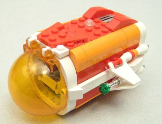
I was able to add small, fold-out wings to the cockpit module, which I think are adorable!
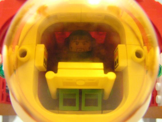
I had hoped to have the pilot sitting at least partway in the bubble of the cockpit, but I don't believe that arrangement is possible at this scale. Getting a picture of him through the glass was also difficult due to reflections.
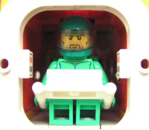
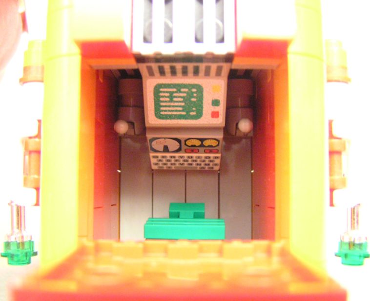
This is the view looking through the opening hatch on the roof. You can see the pilot's backpack, which was a design dictated by the not-too-surprisingly low amount of greeble bricks in green.
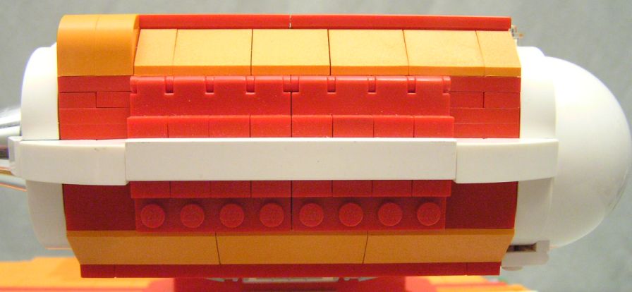
The engine pods were where I spent most of my design time. Even though the landing gear arrangement in the middle of the engine pod totally defeats that idea on a real-world practical level, I was still happy because this is the first time that I've designed landing gear that actually retract inside the vehicle and have opening covers!
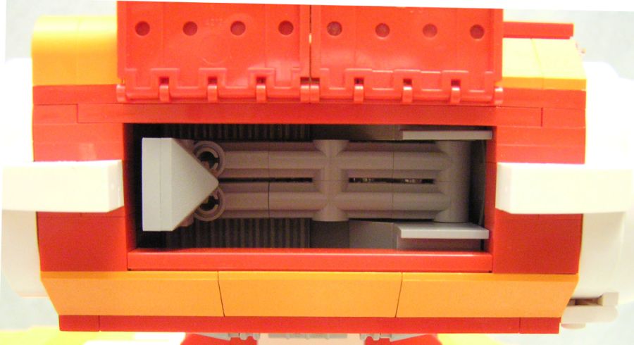
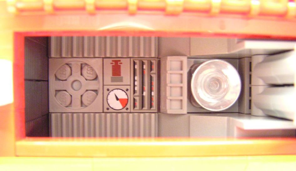
With the landing leg fully extended, the interior detail can be seen. I wanted a spotlight right near the base of the leg and some other greebles and stuff.
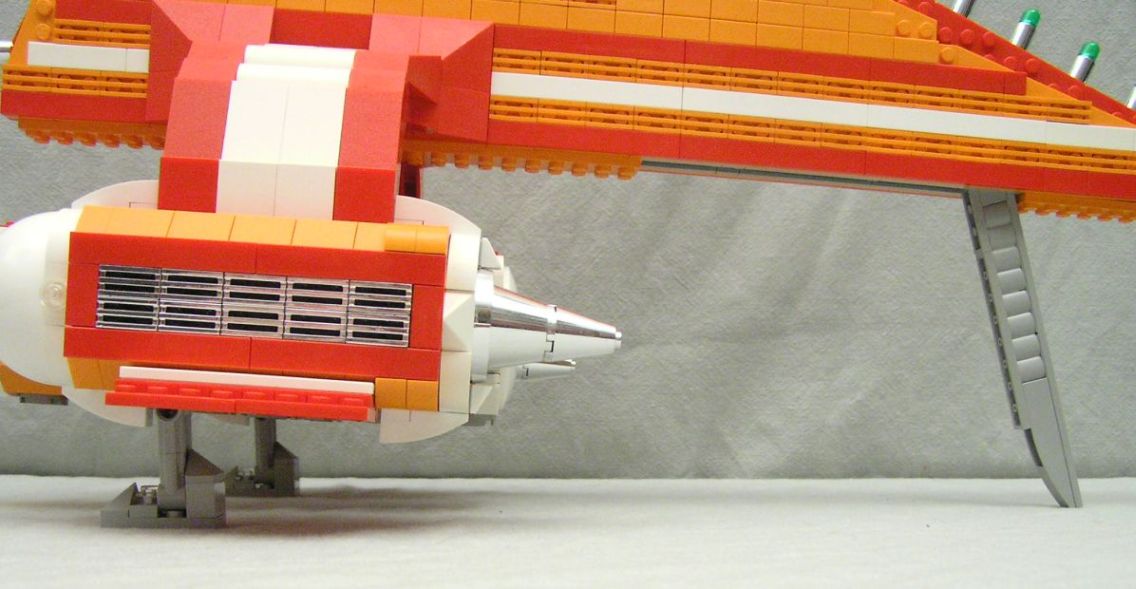
The rear landing leg folds up into the body but still sticks out a bit so it's easy to grab. The leg is attached with a 1x1 brick with studs on all four sides. The entire hull is basically a large sandwich with LOTS of those on the inside! I like the way the ship has a slight tilt.
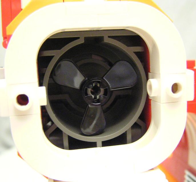
Again, even though it doesn't make any sense, I like that I was able to add this fan housing to front of the inside of the engines. You just rotate the hinged white dome out of the way.
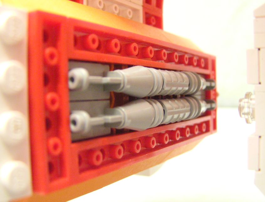
My one bit of exterior greebling on the inside of the engines. I decided to make everything mechanical gray in color, in order to more strongly contrast different areas on the ship.
